BRANDING
Below we will guide you through how the final identity of a brand is developed and what factors are taken into consideration.
Bite Coffee
For our example, we have selected a special place where coffee and in-house chocolate are served. The chocolate comes in pistachio and coffee flavour, the café is called Bite Coffee.

colour
One of the most important elements are colours. Colours always evoke some emotion, choosing the appropriate colours is therefore crucial. Clients often have concrete ideas about what colours they would like to see. We compare these with the ones used in the industry concerned, and if we think some colours are not the right pick, we propose new ones.
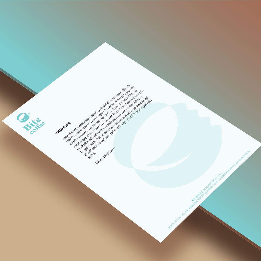
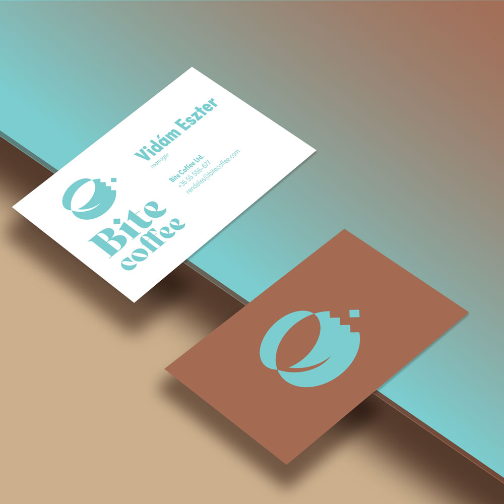
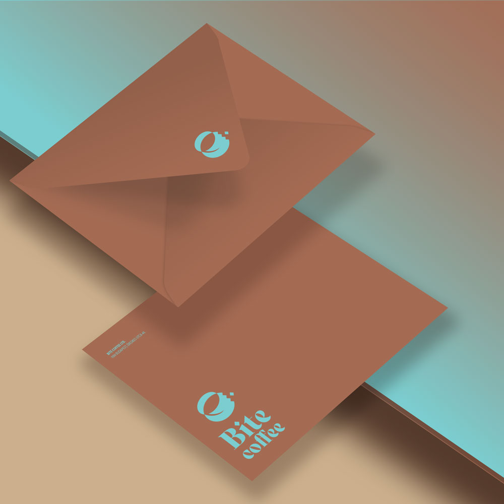
In our case, the palette consists of roasted coffee, chocolate brown and pistachio green, which are accompanied by black and pale blue.

font type
We need to know the target group to select the font type, even if they make up a broad set. This together with industrial characteristics define what font style we should use. For the logo, we have selected a font type designed by Roxane Gataud and settled on the Sofia Pro Condensed set for the content.

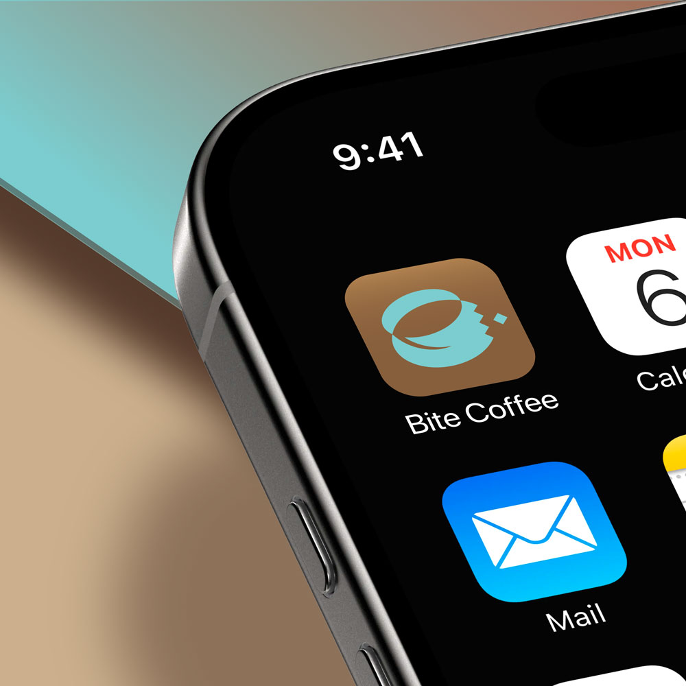
logo
Everything is built around the logo. The goal is to have an emphatic and unique logo which is thus easy to remember. Before we design the logo, we need to know what modes of use it will have.
This logo will be used as an app icon, a profile picture and will be imprinted on the chocolate bars.
office
Alone or together, the elements of a befitting image make a brand identifiable. Basically, that is why you need it.
We need to consider the taste of the target group, the values of the company, and the brand identity of the competitors. Generally, we aim for simplicity, as complicated graphic solutions make production more difficult and the number of colours affects the costs.
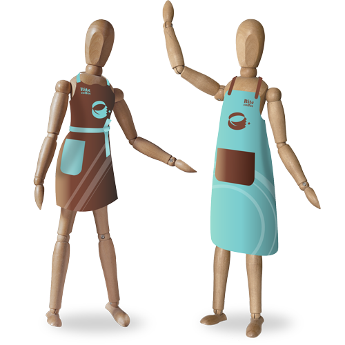
workwear
Durability and comfort are essential aspects when the workwear is for everyday use. To equip the clothing with brand elements, we need to know what material the garment is made of and what technology will be used to apply the pattern.
The brown apron is for the chocolatiers, the blue one is for the baristas. The barista apron is made of a thicker material and covers a larger area on account of the hot coffee. Chocolatiers wear a more comfortable apron to allow freer movement. The inscription “Bite Coffee” is sewn and the symbols are ironed onto the fabric.
decoration
Minimalism is an absolute favourite of ours. The graphic on the wall in the customer area has been produced with the colours listed above. The pastel colours soften the picture, the figures catch the eye. This design can be painted directly on the wall if so required.
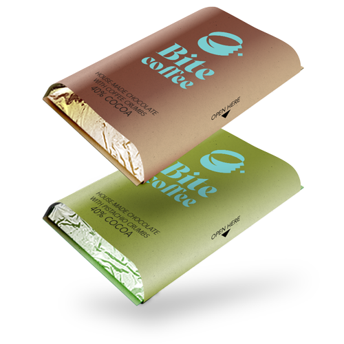
product
When it comes to products, you may depart from the overall corporate image. A product can have its own face or an entire product line may boast a different design. Nonetheless, it might be a good idea for the product and the company to have the same design, especially in the case of a startup. A design element placed on an object which people take with them, such as a coffee cup or the chocolate wrapping, provides an excellent point of brand engagement.
The chocolates sold in this shop are made and wrapped manually. Therefore, we have opted for simple packaging — aluminium foil and paper wrapped around, with few but distinct colours and some vintage style graphic.
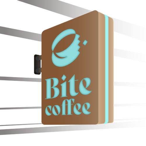
signboard
With regard to signboards, besides many other things, we need to consider whether the board will be placed outdoors or indoors, and how much space there will be for mounting it.
For this shop, we have envisaged a board that is striking yet eco-friendly in terms of light pollution. One that is low on energy consumption and can be made from green materials. The lamp is enveloped in translucent textile with a painted graphic.